Pursuing perfection is not always the best choice. Like Starbucks and Google giant brands Their choice of logo proves this to us.
These brands, which show us that sometimes ‘imperfect’ things can produce ‘perfect’ results, consciously choose logos with some mistakes. well thought out reasons lies. In other words, even what seems like a “mistake” is actually a “flawlessly” thought-out strategy.
Let’s go through the examples and start with Google’s logo.
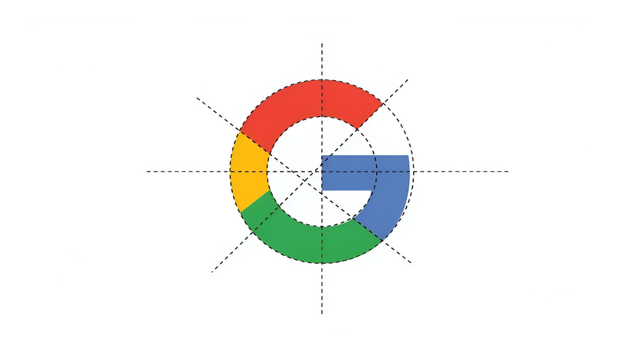
At first glance, Google’s letter “G” logo looks pretty neat, right? However, if we examine it in detail, we see that the letter “G” is geometric you are not perfect we can see.
Inner circles that do not align, lines that do not intersect, and inconsistent color distributions are actually geometric and flawed by design A logo is revealed.
But the perfection of this logo lies in its flaws!
There’s a reason why the Google logo isn’t perfect. In typography “exceedance” The concept basically means that the curved parts of a text are deliberately pushed beyond the boundaries.
Although this situation is symmetrical and geometrically incorrect, it is used to achieve a natural appearance that will deceive the human eye. an optically correct result makes it possible to obtain these.
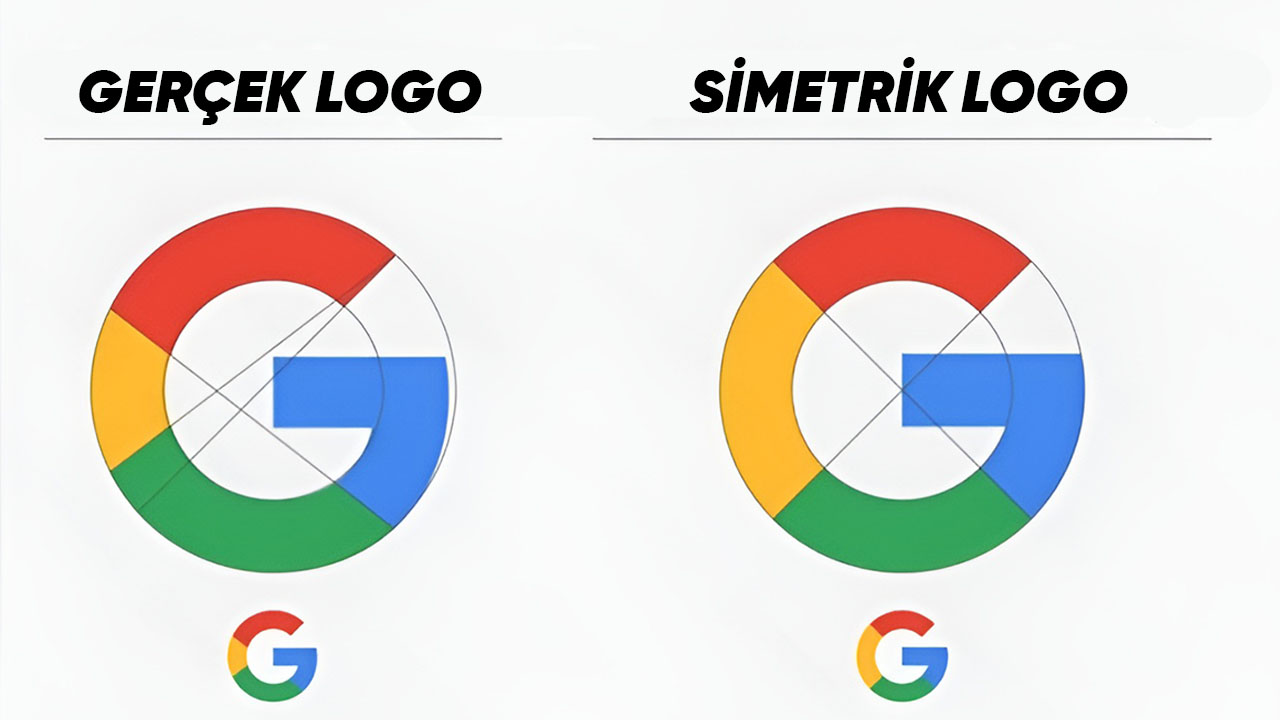
The minor changes we made when we recreated the logo symmetrically as shown in the image above. big differences We see you creating.
The blue part sticks out too much, the yellow color overshadows other colors next to it, etc. Google, considering all situations, is symmetrically wrong, but if the human eye is taken into account easy to look at and balanced in every way uses a logo.
In other words, Google has created an ‘imperfect’ logo that makes it pleasant to look at, without compromising the brand colors. perfect thinking the preference.
Let’s take a look at Starbucks’ iconic but “imperfect” mermaid logo.
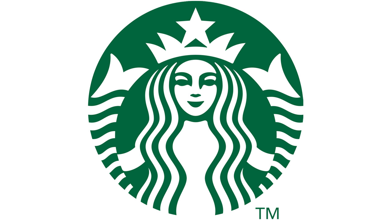
This is also the well-known brand logo asymmetries contains.
For example, one side of the mermaid’s face shadier than the others.
The main reason for this is to make an asymmetrical face look more human!
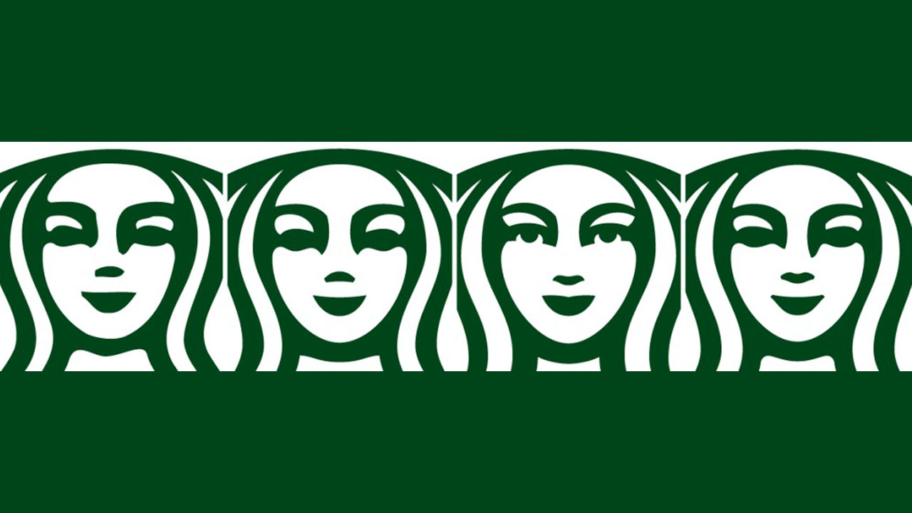
If we look at the different logo designs above, we can see that the face is quite symmetrical. away from humanity is seen.
The design team will also be aware of this situation, so that instead of a cold drawing, a mysterious and To create a human figure They chose to create a ‘defective’ design.
In summary: mainly Google, Starbucks and many other big brands manage their perceptions they want. Whatever math and symmetry say, their goal is to attract the attention and admiration of their customers, that is, of us. To impress us even more They think so carefully.
Don’t say it’s a minor asymmetry problem. That’s how brands are with carefully thought out movements We can also say that it traps us.
Source: Medium, Fast Company, Media Marketing
Our other content that may interest you:
Follow Webtekno on Threads and don’t miss the news


