Windows Start menu, go back in time please
- January 15, 2023
- 0
The Windows Start menu is an essential element of the system for the vast majority of Windows users. For those who regularly repeat the same two or three
The Windows Start menu is an essential element of the system for the vast majority of Windows users. For those who regularly repeat the same two or three

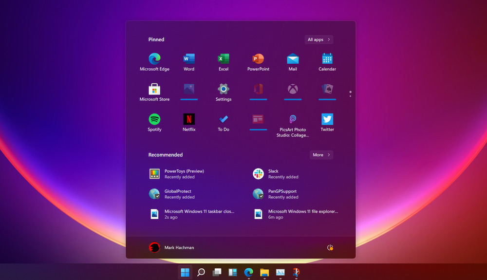
The Windows Start menu is an essential element of the system for the vast majority of Windows users. For those who regularly repeat the same two or three tasks, its use may be much less thanks to shortcuts, but for the rest, apart from those who directly use the search bar, it is a gateway to practically everything that a PC usually does on it.
At Microsoft, they are fully aware of this, which is why it is an element of the Windows interface that they regularly refresh. For better or worse? This is extremely subjective, most of the improvements will really appeal to some users and significantly disappoint many others, but given the total number of users that Windows has, it makes sense. Designing a Start menu that will be equally satisfying for all users of the system requires an engineering exercise similar to what will be required to get humans to Mars.
Whenever a comparison is made between Microsoft and Apple, the difference in design philosophy cannot be overlooked. Those from Cupertino always tend to look for “less is more” (yes, we’ve seen exceptions in this regard, I’m speaking in general). Microsoft, for its part, and while it seems to have improved in this regard, it’s always been more about making the most of space by filling it with stuff. Again, Microsoft has evolved in this regard (for the better, in my opinion), but to understand where we are coming from, let me share with you an old video (from the mid-2000s) in which the over-the-top satire, its purpose was to show , how Microsoft would design a box for the Apple iPod:
That’s an exaggeration, of course, but it reflects that Microsoft has always really preferred to concentrate a lot of things in a relatively small space. Which, I repeat, is neither good nor bad, it’s a matter of taste. And if not, tell the users who miss (or even continue to use) applications with interfaces like Winamp.
The evolution of the Start Menu, with its pluses and minuses, did not escape this desire on the part of Microsoft to amortize the pixels of the screen well and, in addition, to significantly increase its size compared to the one contained in the first version of the operating system. So the question is, what if it’s time to take a step back in this regard?
Reddit user hairybolox posted his own design (which means it’s not something Microsoft is working on) that went viral and brought the design paradigm behind the Windows Start menu to Windows 11. Windows 9x (ie 95 and 98), simple . a clean design that surprises at first glance.

I don’t know what you think, but in my case I was particularly pleased with this image, the concept restores the simplicity of the Start menu, where you always found what you were looking for in a flash. What do you think? Do you prefer the current model or would you like something like the one proposed by hairybolox?
Source: Muy Computer
Alice Smith is a seasoned journalist and writer for Div Bracket. She has a keen sense of what’s important and is always on top of the latest trends. Alice provides in-depth coverage of the most talked-about news stories, delivering insightful and thought-provoking articles that keep her readers informed and engaged.